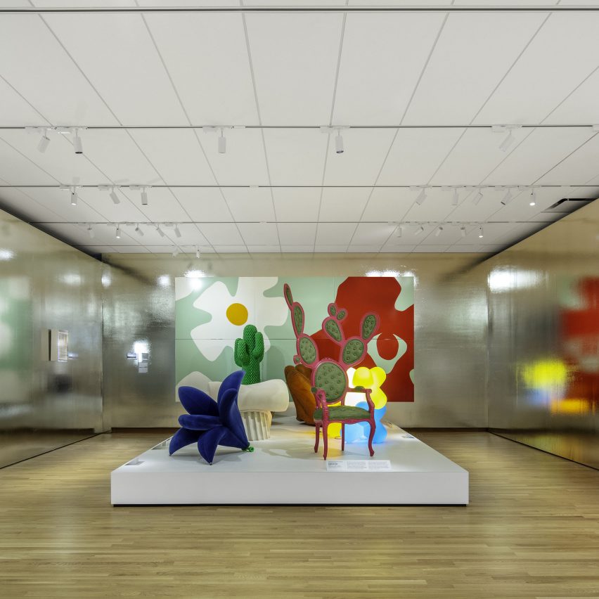
The New York office of architecture firm OMA has designed galleries and a studio inside Gio Ponti's Denver Art Museum, which recently underwent a major redevelopment.
As part of the project OMA designed 11,500 square feet (1,068 square metres) of new and renovated galleries inside Ponti's 1971 Martin Building, as well as a studio space.
The spaces form part of a wider overhaul and extension of the campus, carried out by Machado Silvetti Architects and Fentress Architects and completed in September 2021.
The three spaces by OMA, which the firm first unveiled plans for in January 2020, include the Design Gallery, Mezzanine Gallery and Design Studio – all distinct yet interconnected.
"It was an exciting exercise, designing within the historic Gio Ponti building and drawing from his extensive, multi-faceted body of work," said OMA partner Shohei Shigematsu.
"Much like his design philosophy, the role of design seems to grow and diversify exponentially," he continued. "A direct consequence of design ubiquity is accessibility and literacy, and we wanted the galleries to react to these changes."
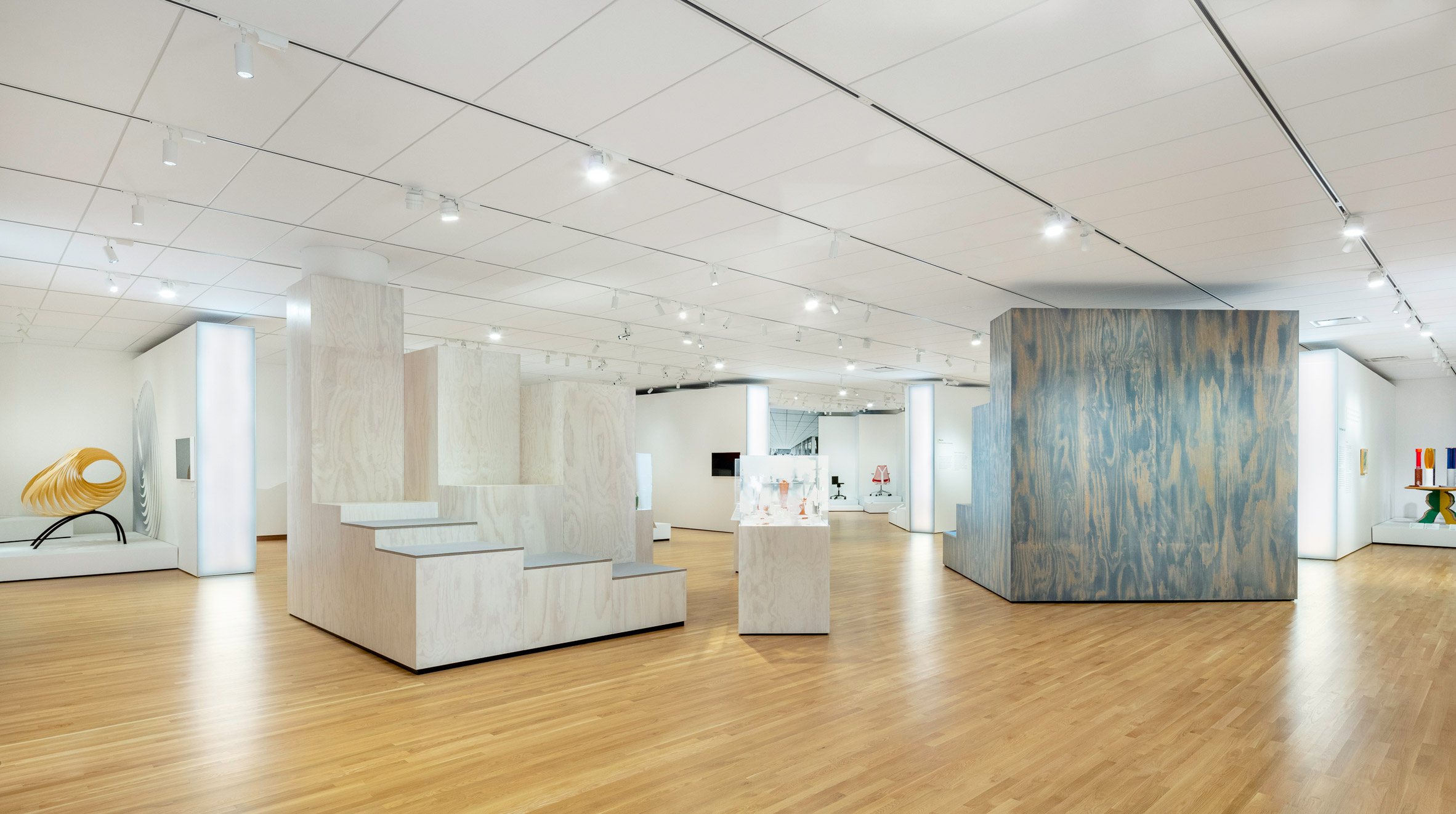
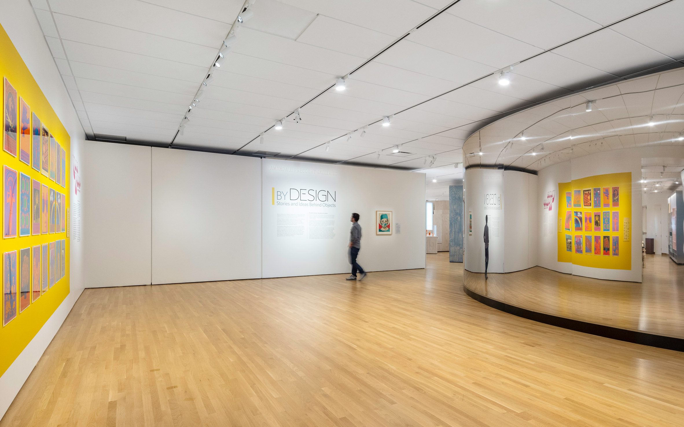
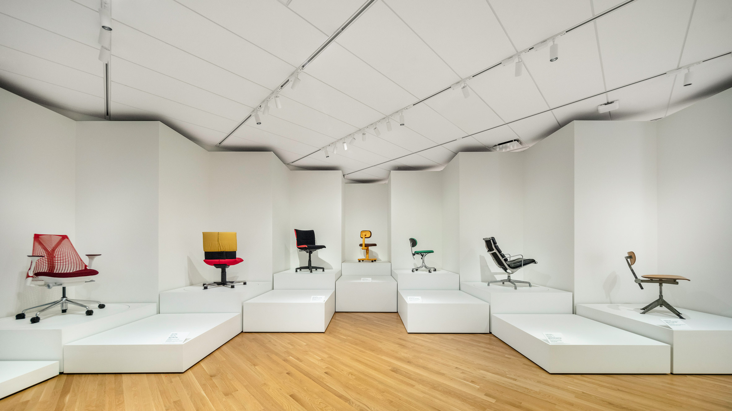
The 7,750-square-foot (720-square-metre) Design Gallery is laid out around a central "piazza" surrounded by an alternating sequence of rooms and islands.
For the opening exhibition, titled By Design: Stories and Ideas Behind Objects, the displays are formed from a variety of modular, flexible platforms that can be viewed simultaneously from different vantage points.
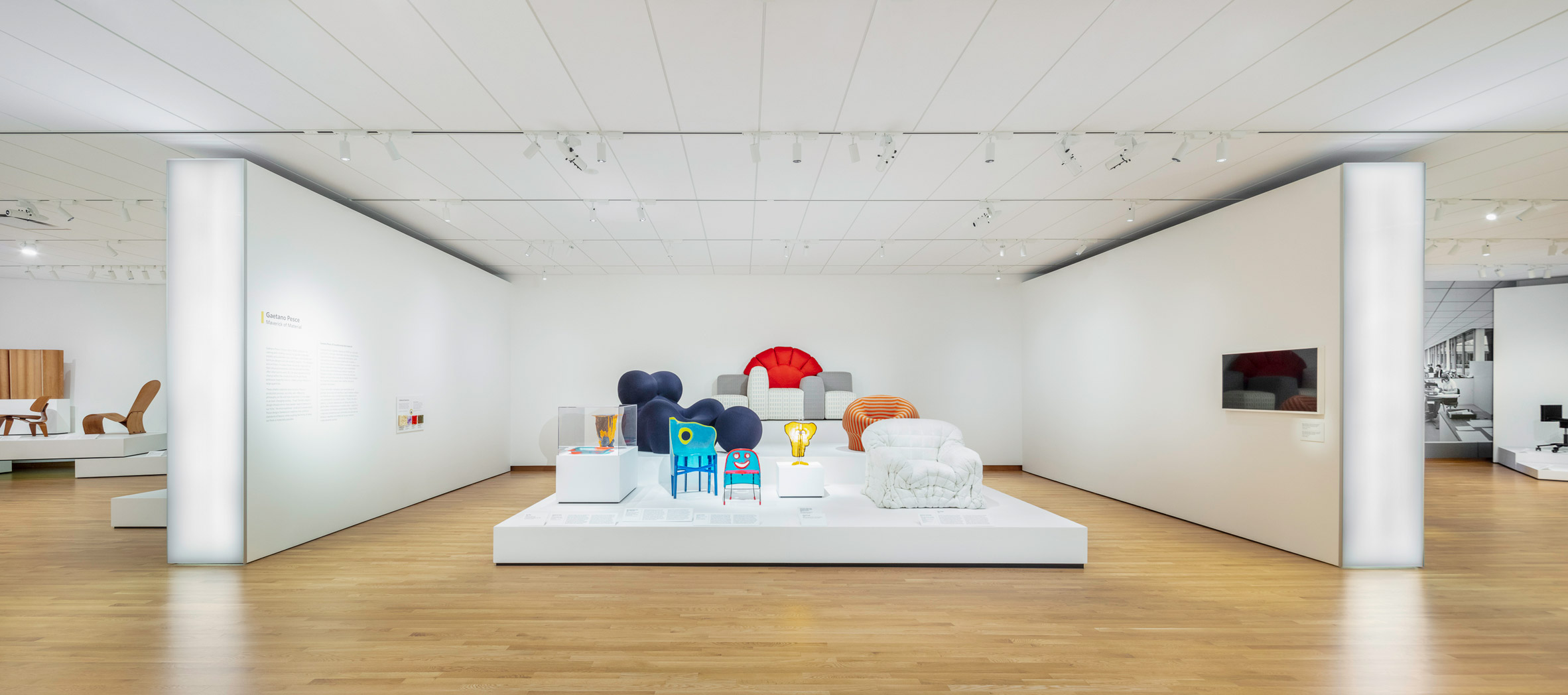
Made from a range of materials, including plywood and resin, the plinths and podiums are aligned with a grid but can be rearranged for future shows.
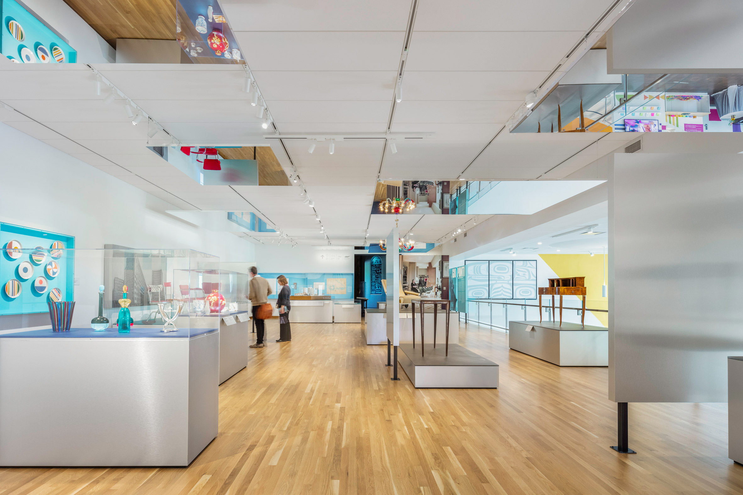
Reflective surfaces wrap a curved wall at the entrance to the gallery, which echoes the shape of the building, and line one of the display rooms.
Meanwhile in the smaller Mezzanine Gallery, which measures 1,900 square feet (177 square metres), a series of ceiling-mounted mirrors run through the exhibit.
Aptly presenting a retrospective of work by Ponti to coincide with the reopening, the gallery features display structures, platforms and signage are intended to mimic the shifted volumes in the famed architect's work.
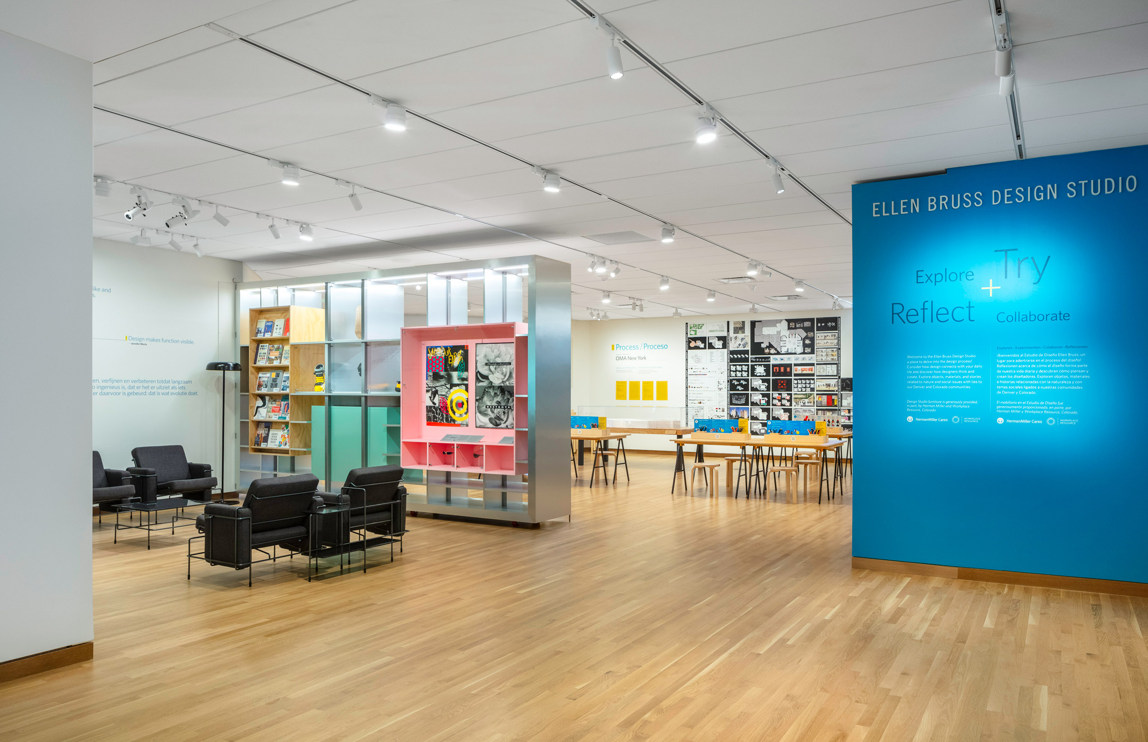
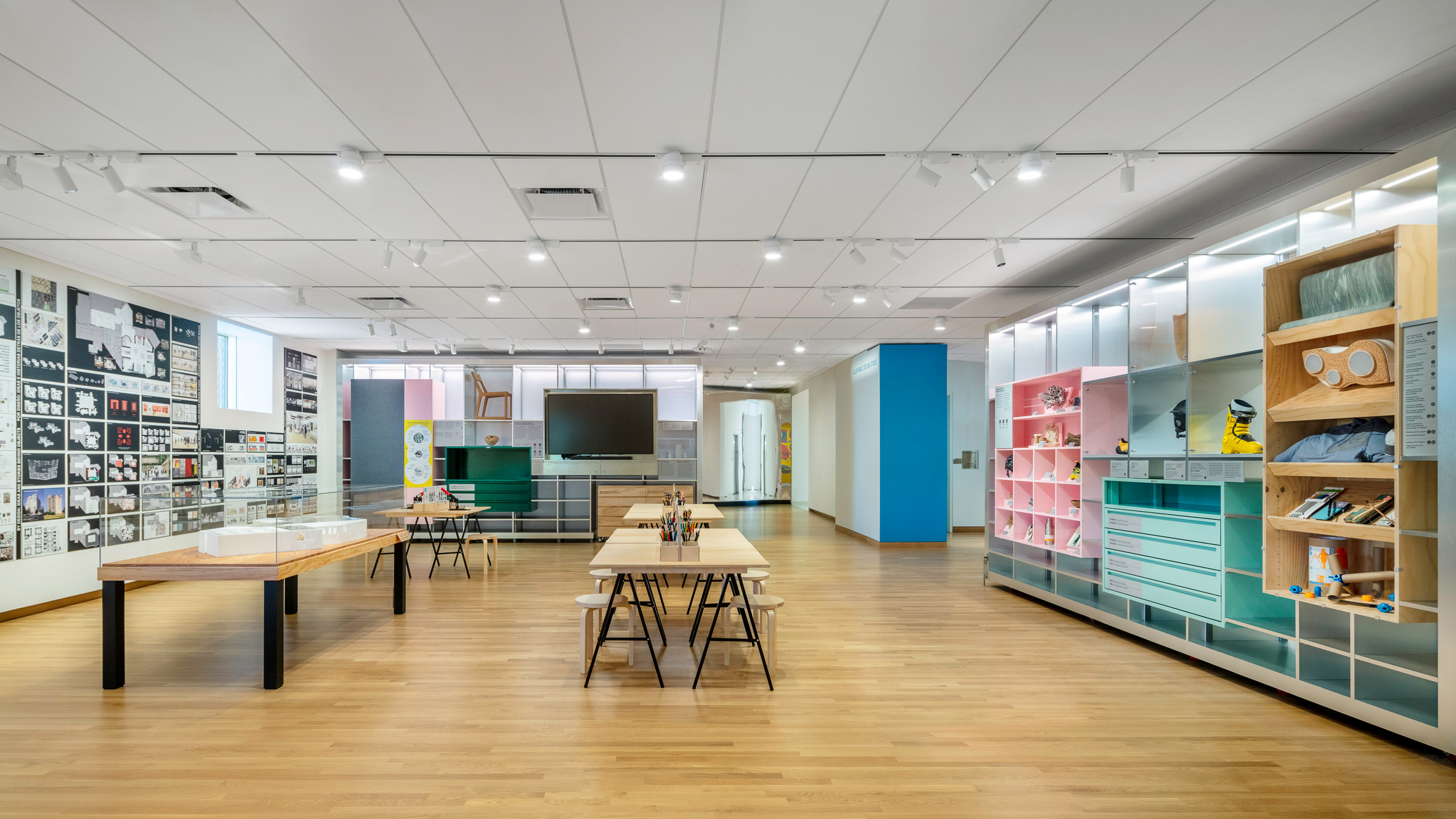
In the Design Studio, visitors are encouraged to freely explore the creative processes, and engage with objects and materials left for their use.
The flexible and interactive space has hinged walls, which shift with the studio's requirements and also double as both displays and storage.
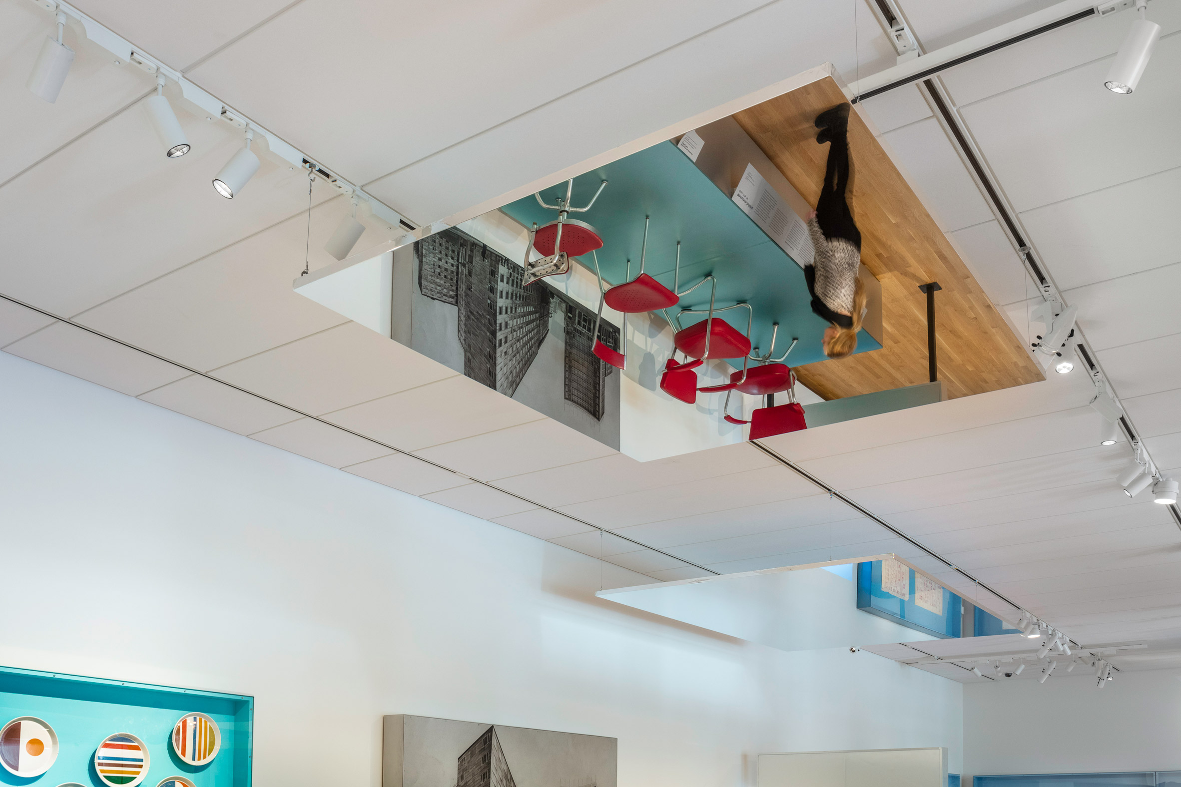
"The three spaces pose new ways of seeing as well as interacting with objects and materials—they present different spatial and programmatic identities," said Shigematsu, "but work collectively as a platform for shifting the discourse beyond mere consumption of design, by incorporating movement, odd perspectives, and intimacy."
OMA's work with the Denver Art Museum (DAM) follows its exhibition design for Dior: From Paris to the World, staged at the museum in 2018 before moving to the Dallas Art Museum the following year.
"Working with the Denver Art Museum team on the architecture and design galleries and studio was a particularly meaningful way for us to continue our collaboration with the museum," said OMA associate Christy Cheng.
"Architectural and design objects are ones that people encounter every day, and we loved working with DAM to consider how to best tell the stories behind those objects so that the visitor understands design as a process."
The firm's New York office also created the scenography for Manus x Machina, a showcase of fashion and technology at The Met's Costume Institute in 2016.
The photography is by James Florio.
The post OMA reveals design galleries at renovated Denver Art Museum appeared first on Dezeen.
No comments:
Post a Comment